Skip to content

Web-ready images and videos, never uploaded

Compress, convert and resize whole batches in your browser, free.

  • Free, forever
  • No uploads
  • Whole batches at once

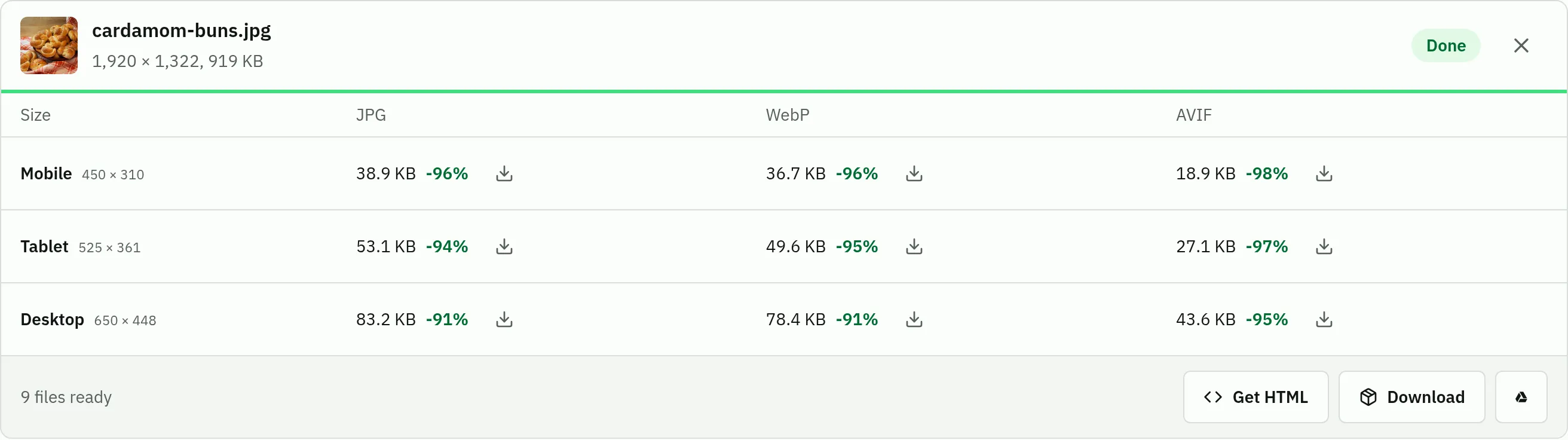
One photo in, nine files out

Three screen sizes, each in AVIF, WebP and JPG, named for your CMS.

The results for cardamom-buns.jpg: Mobile, Tablet and Desktop rows, each with its AVIF, WebP and JPG file, its size and a download buttonThe results for cardamom-buns.jpg: Mobile, Tablet and Desktop rows, each with its AVIF, WebP and JPG file, its size and a download button
A 1920 px photo after the default settings.
<picture> markup for these files
<picture>
  <source type="image/avif"
    srcset="cardamom-buns-compressed-mobile.avif 450w,
             cardamom-buns-compressed-tablet.avif 525w,
             cardamom-buns-compressed-desktop.avif 650w"
    sizes="(max-width: 450px) 100vw, (max-width: 1050px) 50vw, 33vw">
  <source type="image/webp"
    srcset="cardamom-buns-compressed-mobile.webp 450w,
             cardamom-buns-compressed-tablet.webp 525w,
             cardamom-buns-compressed-desktop.webp 650w"
    sizes="(max-width: 450px) 100vw, (max-width: 1050px) 50vw, 33vw">
  <img src="cardamom-buns-compressed-desktop.jpg"
    srcset="cardamom-buns-compressed-mobile.jpg 450w,
             cardamom-buns-compressed-tablet.jpg 525w,
             cardamom-buns-compressed-desktop.jpg 650w"
    sizes="(max-width: 450px) 100vw, (max-width: 1050px) 50vw, 33vw"
    width="650" height="448"
    alt="" loading="lazy">
</picture>

For the CMS: one zip with every file, or straight to Google Drive.

For the code: the <picture> markup for each image, ready to copy.

From the CMS to the code

Content teams
Agency PNGs made light enough for WordPress, Shopify or Webflow.
Developers
Every srcset width in AVIF, WebP and JPG, named the same way.
Client work
Files stay on your laptop, so there is no third party to vet.

Say where the image goes

Pick a layout and see every screen size drawn to scale.

Preview to scaleGreen is your file
Mobile, 450 px
450 px wide
Tablet, 1,050 px
525 px wide
Desktop, 1,950 px
650 px wide

What it needs from you

MoneyNone. No account, no plan, no watermark.
Your filesOpened in your browser and never sent to a server.
Your computerIt does the encoding, so big batches and long videos take a while.
Your browserA current one, on a desktop or a phone. HEVC video depends on your hardware.

Start with your own images

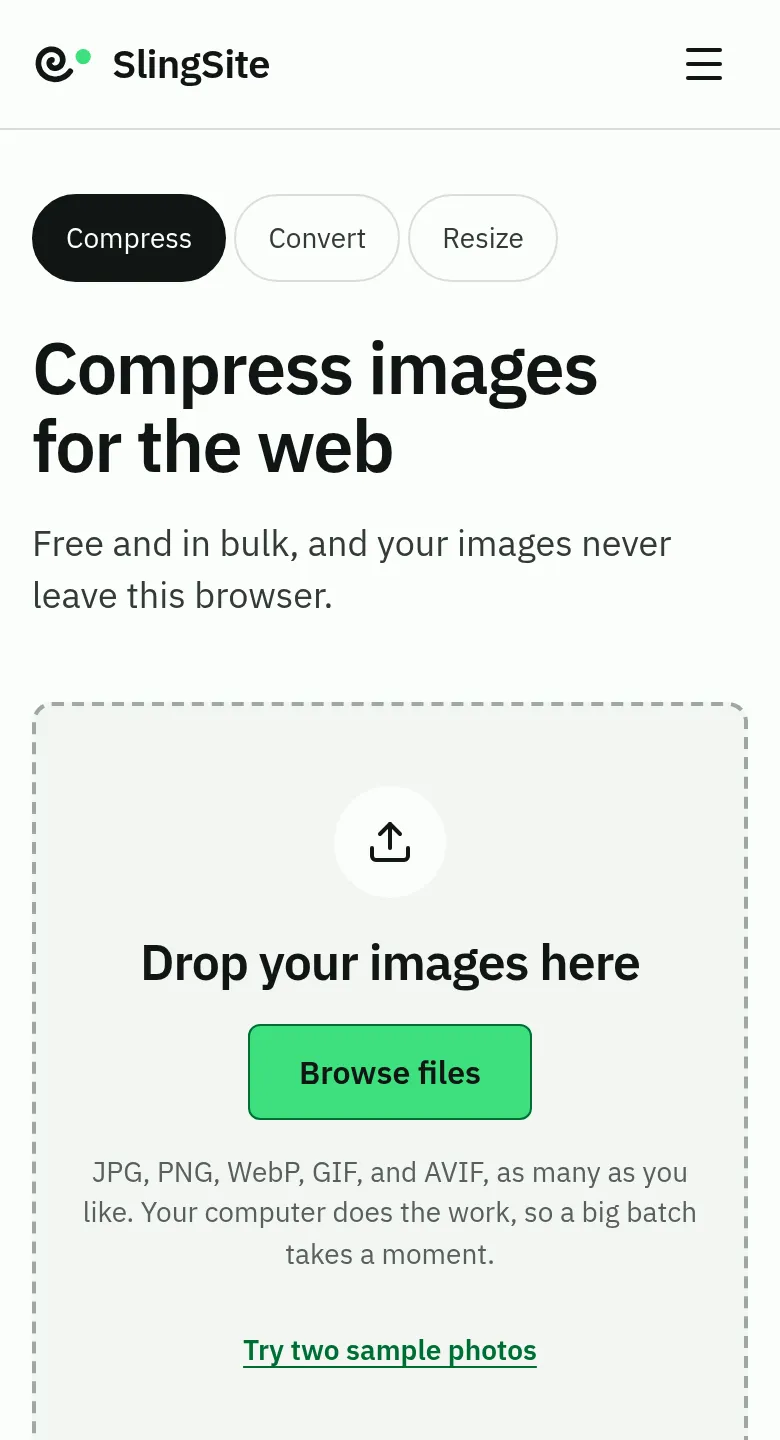
Drop a whole batch and get one zip back. It works the same on a phone.

The image compressor on a phone: the heading, then the dropzone with its Browse files buttonThe image compressor on a phone: the heading, then the dropzone with its Browse files button

Free media tools that respect your privacy

Most online image and video tools upload your files to a server, process them there and send them back. SlingSite works differently: the whole job happens inside your browser, using the processing power of your own device. That makes it private by design, free to run, and fast for large batches, because nothing has to travel over the network.

Frequently asked questions

Is SlingSite really free?

Yes. Every tool is free, with no account, no watermark and no limit on the number of files. Because the processing runs on your device, we have no servers to pay for per file.

Which tool should I use?

To publish images or videos on a website, use the web optimizer: it creates mobile, tablet and desktop sizes in modern formats. To change only the dimensions, use the resizer. To change only the format, use the converter. To get a still image from a video, use the thumbnail extractor.

Which formats are supported?

You can open JPG, PNG, WebP, GIF, AVIF, MP4, WebM, MOV, MKV and any other format your browser can decode. Images can be saved as JPG, PNG, WebP or AVIF, and videos as MP4 (H.264 or H.265) or WebM (VP9).

Does it work on my phone?

Yes. SlingSite runs in any modern browser on computers, tablets and phones. Large videos are faster on a computer, since everything runs on your device.